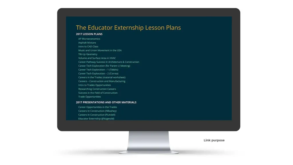
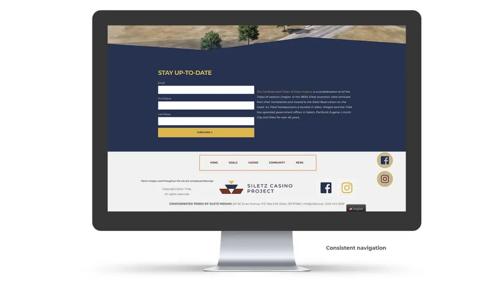
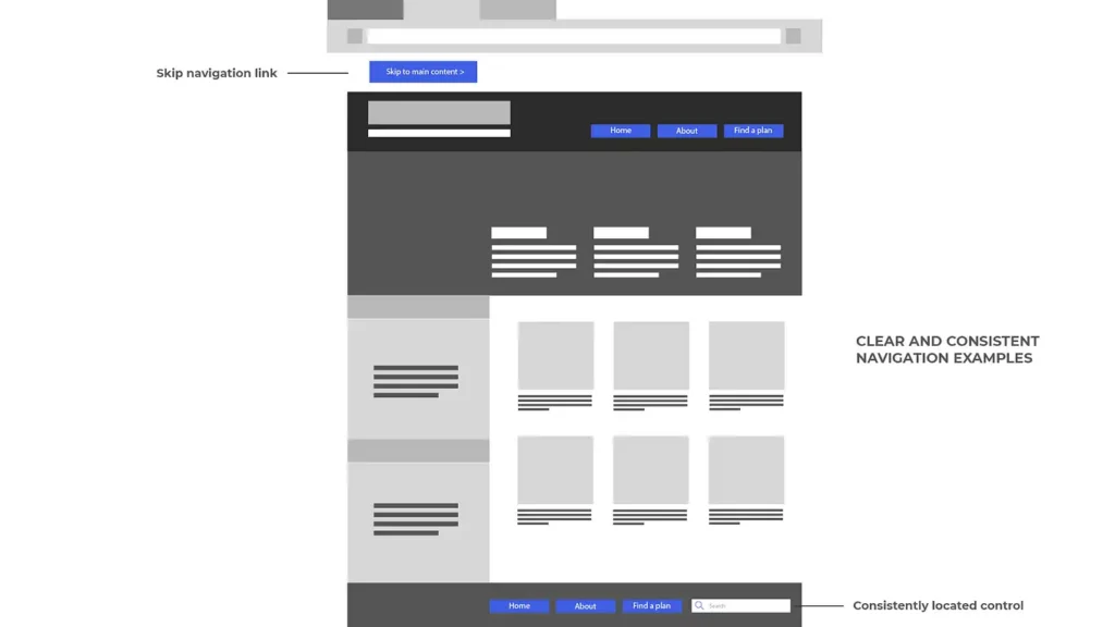
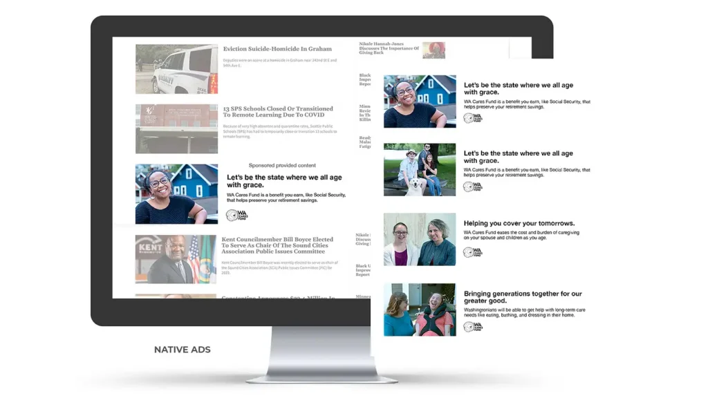
Experience with Inclusive Design Standards

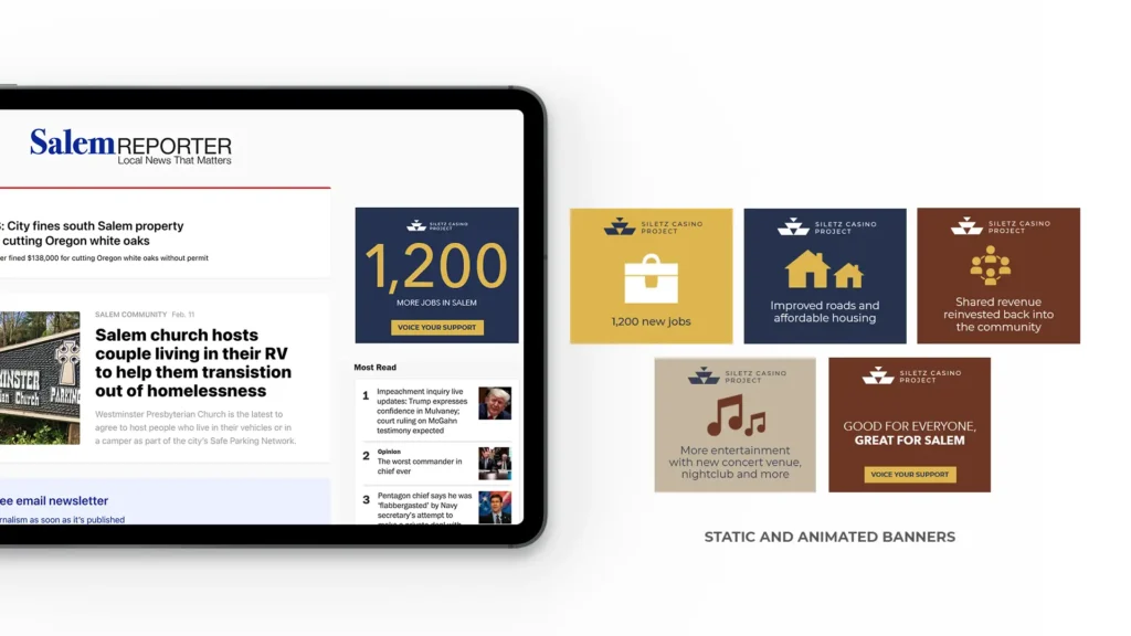
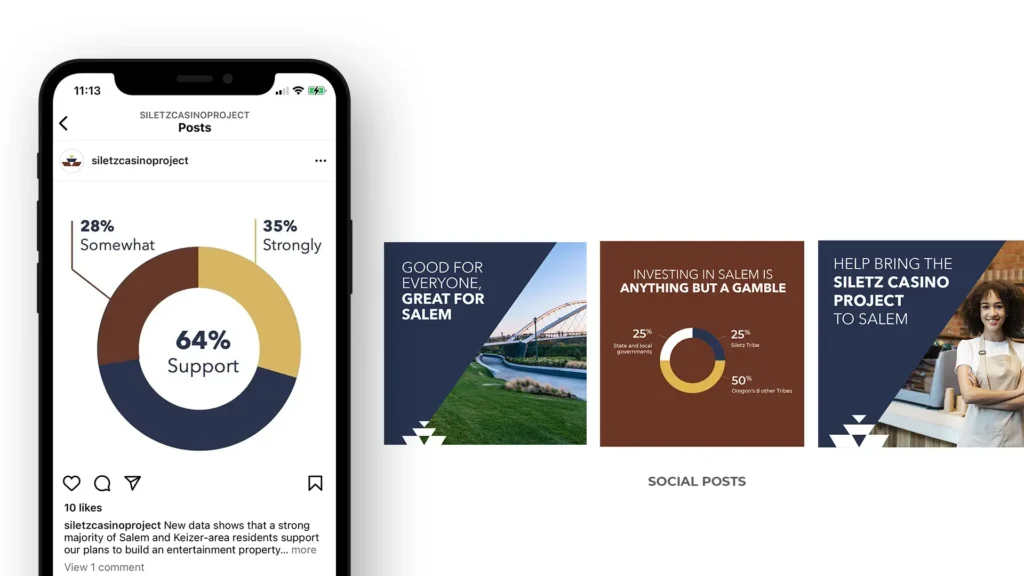
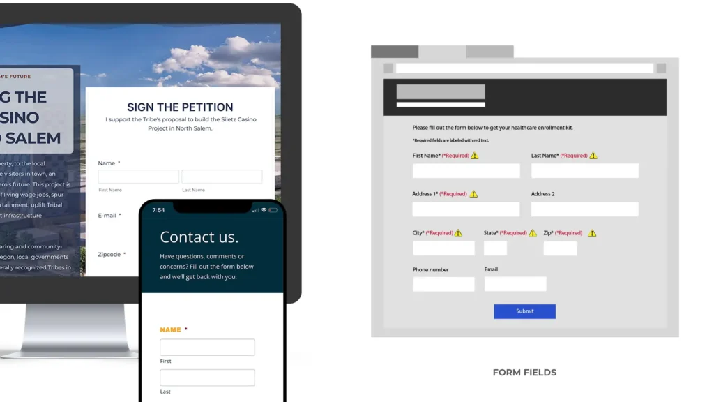
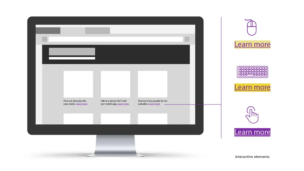
Creating visual design collateral that aligns with the WCAG 2.1 AA standards, DEI, and accessible visual design standards is an integral part of successful marketing initiatives. Below are examples of how Quinn Thomas has incorporated those standards in our work including websites, social, digital assets, videography, and photography.

Provide sufficient contrast between foreground and background

The Confederated Tribes of Siletz Indians hired us to create an awareness campaign to gain support for a new casino in Salem, Oregon. Through social and digital banners, we drove people to their website to learn more about the benefits for Salem and its residents. All materials align to the WCAG 1.4.3 Contrast success criterion. Below are visual examples of some of the work.

Don’t use color alone to convey information

Websites we built for the Confederated Tribes of Siletz Indians and Build Oregon contain form fields that use text and a red asterisk for required sections to convey information. Another sample below demonstrates a form field with required text in red along with an icon so users can determine the required fields. These examples convey information, indicate an action, prompt a response, and distinguish a visual element using color accompanied by other elements as outlined in WCAG 1.4.1 Use of Color success criterion.

Interactive elements are easy to identify

Content on hover or focus

The example shows distinct styles for interactive elements and how a link changes appearance for mouse hover, keyboard focus, and touch-screen activation as outlined in WCAG 1.4.13 Content on Hover or Focus success criterion.

Link purpose (in context)

Quinn Thomas was tasked with building an easy-to-use online career resource for the construction industry called Build Oregon. The primary audience for the website is high school educators who need to access a wide variety of learning curriculum. The Web page demonstrates how we organized and labeled the curriculum, so it is easy to access. The purpose of each link can be determined from the link text alone or from the link text together with its programmatically determined link context, as outlined in the WCAG 2.4.4 Link Purpose (In Context) success criterion.

Provide clear and consistent navigation

The website Quinn Thomas built for the Confederated Tribes of Siletz Indians incorporates a secondary navigation that is consistently located at the end of each page. The other sample below displays a navigation link that sits at the top of each page, allowing the user to quickly bypass heading information. It also includes a consistently located search field as the last item on every Web page, providing an easily accessible search option. All materials align to the WCAG 3.2.3 Consistent Navigation success criterion – navigation has a consistent presentation and layout for users who interact with repeated content within a set of Web pages and need to locate specific information or functionality more than once.

Headings and labels are clear

Applying clear labeling to our work helps users understand what information is contained in Web pages and how that information is organized. We’ve included three examples for how headings and labels describe a topic or purpose, in line with WCAG 2.4.6 Headings and Labels success criterion. For Highmark Health Insurance’s microsite, the form for users has clear labels for what sections are required with a commonly used asterisk as well as the word “required”. For the Confederated Tribes of Siletz Indians websitepetition, the form clearly asks the name of the user with two input fields, one for their first name and one for their last name. The Siletz site also contains a map that highlights where the future casino could be. The online map has controls for zooming in and out, allowing users to view in greater detail.

Include image and media alternatives

Build Oregon, a resource hub for skilled trade workers, hired Quinn Thomas to create a marketing campaign to attract more people into the industry. One of our tactics was creating a handful of social videos that interviewed real workers. To ensure the videos could be understood by anyone, we included closed captions. These time-based media captions are provided for all prerecorded audio content in synchronized media as outlined in WCAG 1.2.2 Captions (Prerecorded) success criterion.

Apply racial and equity awareness in visuals

The WA Cares Fundis Washington State’s long-term care program to help individuals who need care that health insurance and Medicare will not cover. To gain awareness, we were engaged to develop marketing materials with imagery that encompass different genders, races, and abilities of real Washingtonians. Quinn Thomas identified eleven Washingtonians that have experience with long-term care. Some of these Washington residents are racially diverse and some have families with loved ones who have a disability. The visual direction for the photoshoots was hopeful, happy, loving, and friendly to convey peace of mind.

Representation of all Washingtonians

The WA Cares Fund needed to represent those who will be opted in to the program in their marketing efforts, which includes all working Washingtonians. To capture real Washingtonians Quinn Thomas identified eleven Washington residents from different backgrounds that have experience with long-term care. From interviews with each subject, we developed videos and a photo library that was used in WA Cares Fund’s marketing initiatives. Using real Washington residents, identified through our relationships with community organizations, allowed us to capture the authenticity and candid stories that aren’t available through paid talent or stock assets.